
My New Favourite Glaze
This glaze recipe has very quickly become one of my favourite bases, and the variation with minor changes in colourants makes it one of the most interesting.

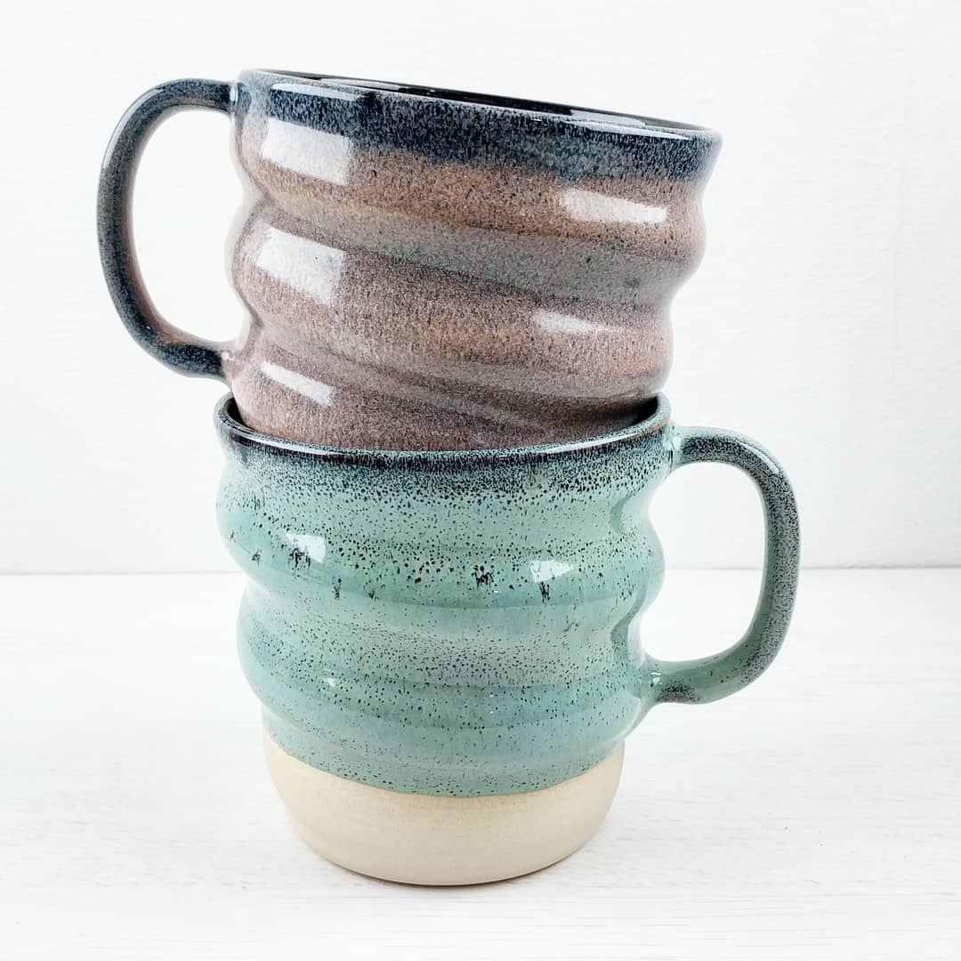
So far I’ve used three versions of it. There’s Borealis (above) which was the original, then Glacier and the NUDITEA special (if you order anything from them, I highly recommend the After Eight Thirty and you can use offer code OLDFORGE for a discount).
The reason that they were developed in that order rather than starting from the base and adding colourants is that this was originally intended to be a variation on a chrome-tin purple.
If you’ve not encountered chrome-tin glazes before, they’re one of the most interesting colour reactions. Chrome is typically a green colourant and tin is typically used as an opacifier / white colourant, but when combined in a very specific base chemistry they will turn bright pinks/purples. This recipe started as an experiment into what Lisa @adie4.designs discovered during the CMW Advanced class, which was that the addition of a small amount of titanium would allow you to keep the brightness of colour with lower levels of tin (very useful as it’s one of the most expensive ingredients) and with higher levels of silica and alumina.
There was an idea that I’d started playing with a year or so before and never concluded, which was that I wanted to recreate the green-red gradient of some succulents. With a chrome-tin glaze this should be as simple as blending a chrome only version of the glaze into a chrome tin version. It’s the tin that turns red so it’s fairly easy to make sure there’s a distinct colour gradient.

Not the best example, but this is the sort of thing I mean
So I took a generic chrome tin recipe, added 1% titanium, and started experimenting with different levels of silica and alumina to see how it behaved. The first results were promising, but I still wanted to increase the silica and alumina slightly to reduce the movement in the glaze.
And then I tried it over the dark clay:
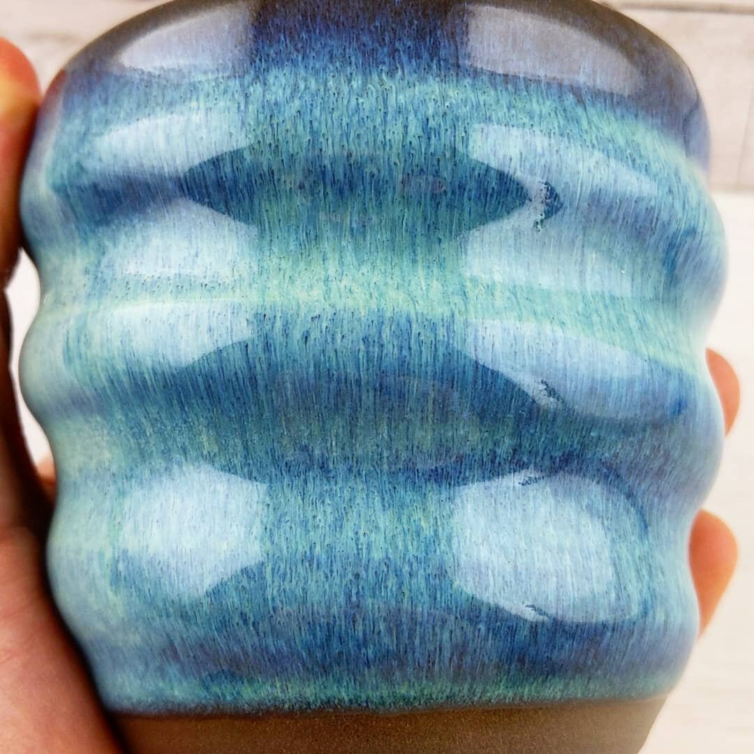
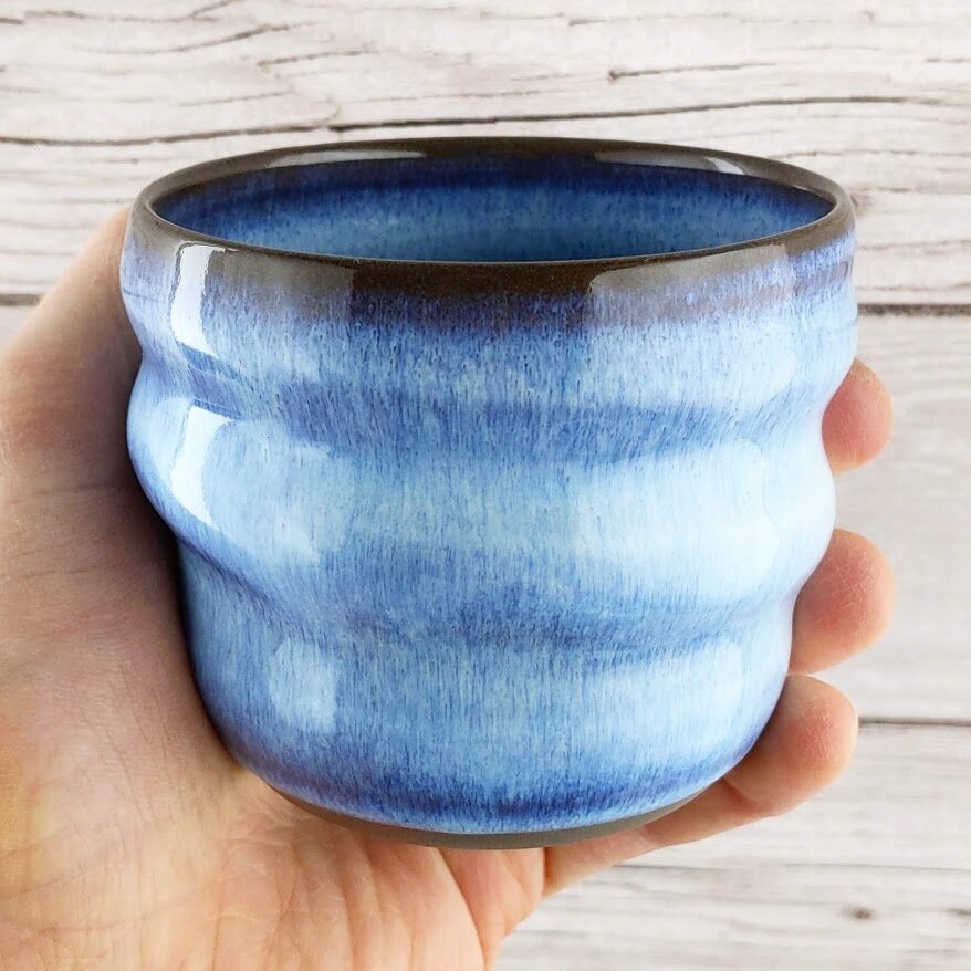
The phase separation from the boron and titanium is much more apparent, the translucency gives it so much more potential for variation based on thickness as the dark clay shows through and the colour which was relatively subtle over white clay becomes far more noticeable. It was at this point that I pretty much abandoned the succulent idea (again) and started playing with variations of this glaze over my dark clay.
The first thing I tried was to just remove the chrome too, for a translucent white glaze. That became Glacier
Then I was working with NUDITEA on a collaboration mug and tea gift set, and their main brand colour is pink. As the recipe was originally a chrome tin purple, I knew that it would be possible to make a pink version. I decided for convenience to use a Mason stain for this version, just because time was relatively tight to get the mugs made and glazed in time for Christmas. The first version I tried was with 5% Mason 6000 and it was exactly what I was hoping for:

I have subsequently tried to recreate the same glaze with tin, and found 1.5% was a pretty similar effect. You might need to add a tiny (think 0.05% or similarly small) amount of chrome, but if there’s any chrome in anything else in the kiln it seems to be enough to get the pink colour without adding it into the glaze
Glaze Recipes
So, those are the variations I’ve used so far. I’ve tried a few other colourants and everything has worked well, but those three have been the best. Glacier / Borealis / NUDITEA
Silica 31%
Nepheline Syenite 29%
Gerstley Borate 19%
Whiting 15%
EP Kaolin 6%
+ Bentonite 2%
+ Titanium Dioxide 1%


How to use the glazes
These are fairly fluid glazes at cone 5-6, and the flowing pattern is produced by movement within the glaze as it melts, so they need to be applied with this in mind. A moderately thick application is best, and a bit of variation in the thickness of glaze over the piece will give more of that Aurora effect.
For the appearance of the pieces shown here, you need to use a dark clay. I’m using a stoneware called Anthracite, it’s a German clay imported into the UK by The Clay Cellar. Over light clays you will get a much more pastel colour and a less obvious pattern, although would still look good with the right colourants.
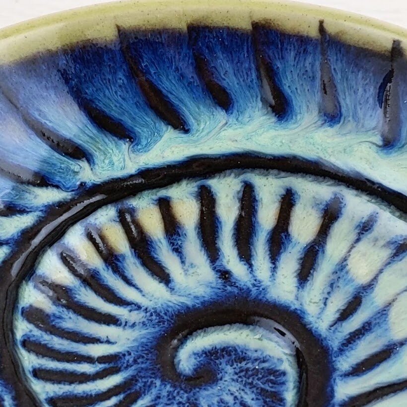
Borealis over Light Clay and Black Slip Nautilus Bowl
Please try it and let me know how you get on, message me or use the hashtag oldforgecreations (I often miss @mentions on Instagram and there's no way to find them afterwards, but I'll see the tag). Good luck!
If you like this sort of content and want to support the creation of more, I now have a Patreon specifically for it or a page on my website if you just want to make a single donation.


